Big Day
Peter Schrager talks about sports the way he'd talk about them with a buddy: direct, a little irreverent, and genuinely excited about whatever's worth talking about that day. Big Day with Peter Schrager gives that voice a national platform daily on ESPN. The show debuted September 10 in the network's 2 p.m. ET weekday slot, originating from New York City and covering the biggest stories across the sports world through reporting, interviews, and conversation with the athletes, coaches, and personalities behind the day's headlines. ESPN brought in BGSTR to build the show's on-air identity.
The brief called for branding that felt like an extension of Peter himself. It needed to be relatable and honest rather than polished or theatrical, confident without being flashy, energetic without being chaotic, and grounded in his Brooklyn roots.
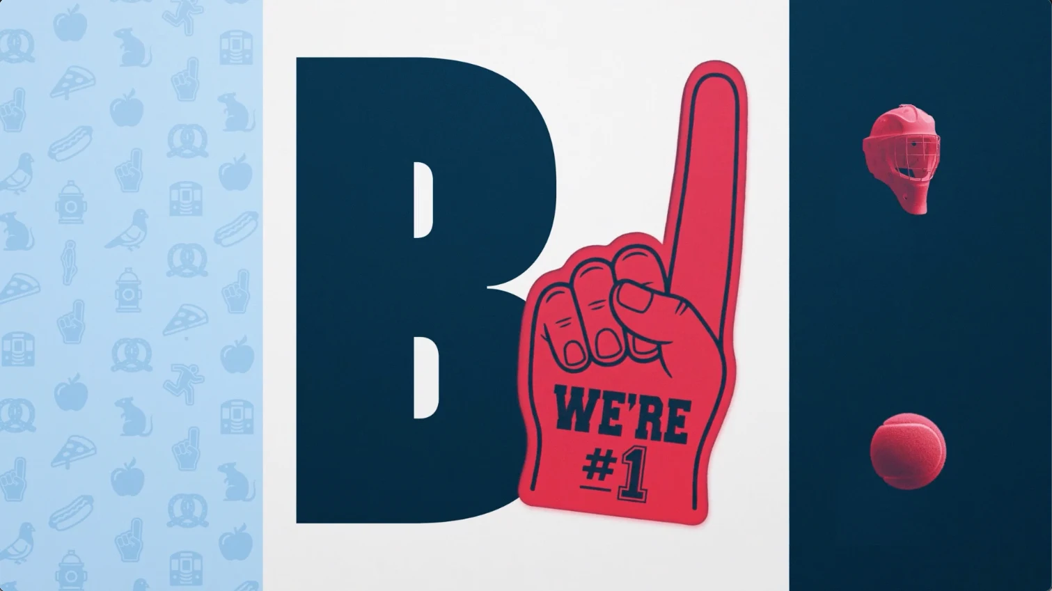
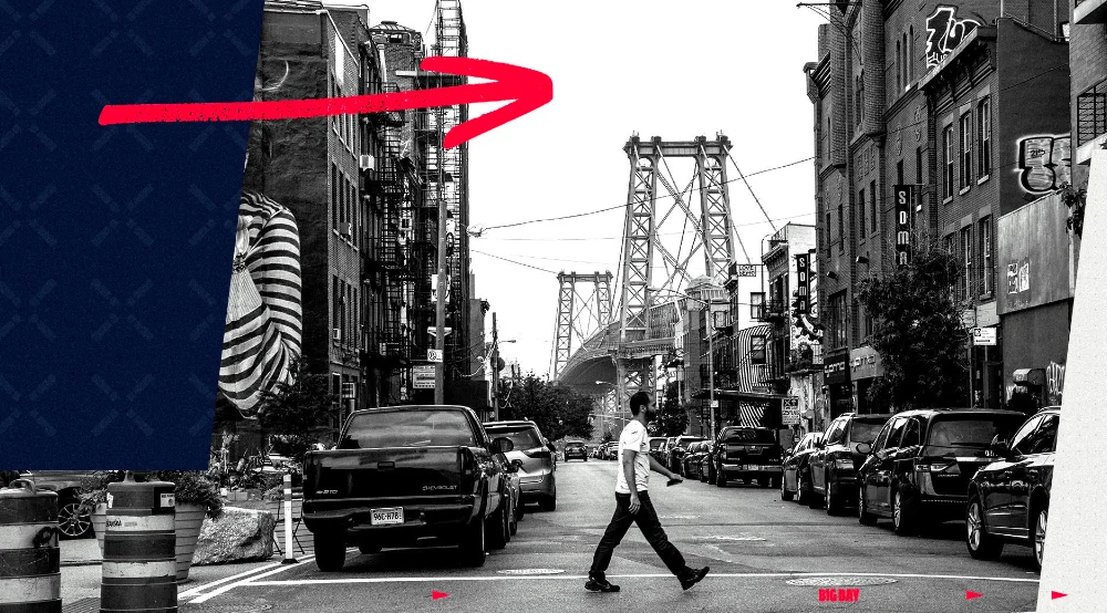
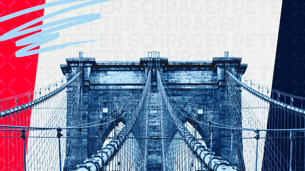
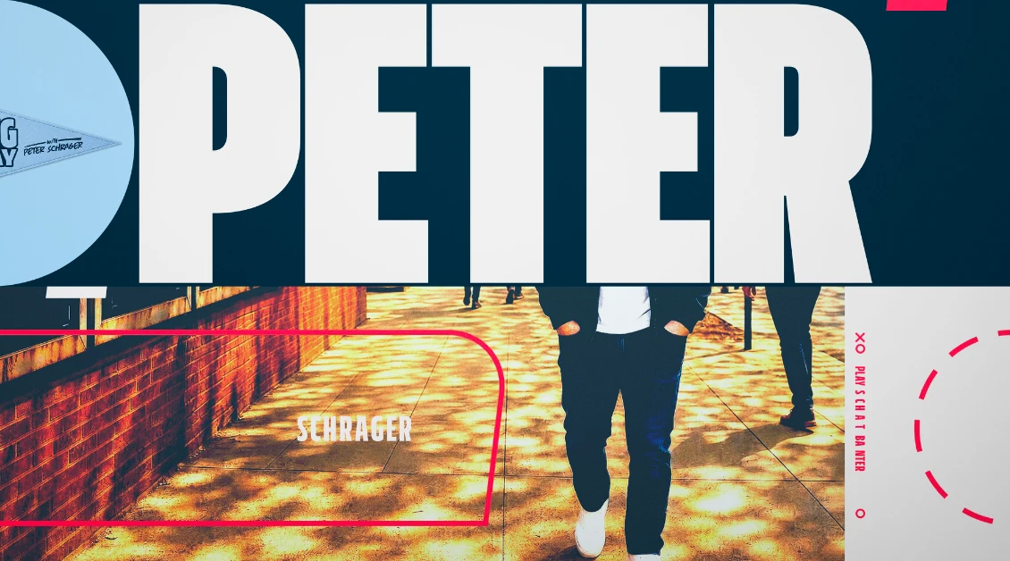
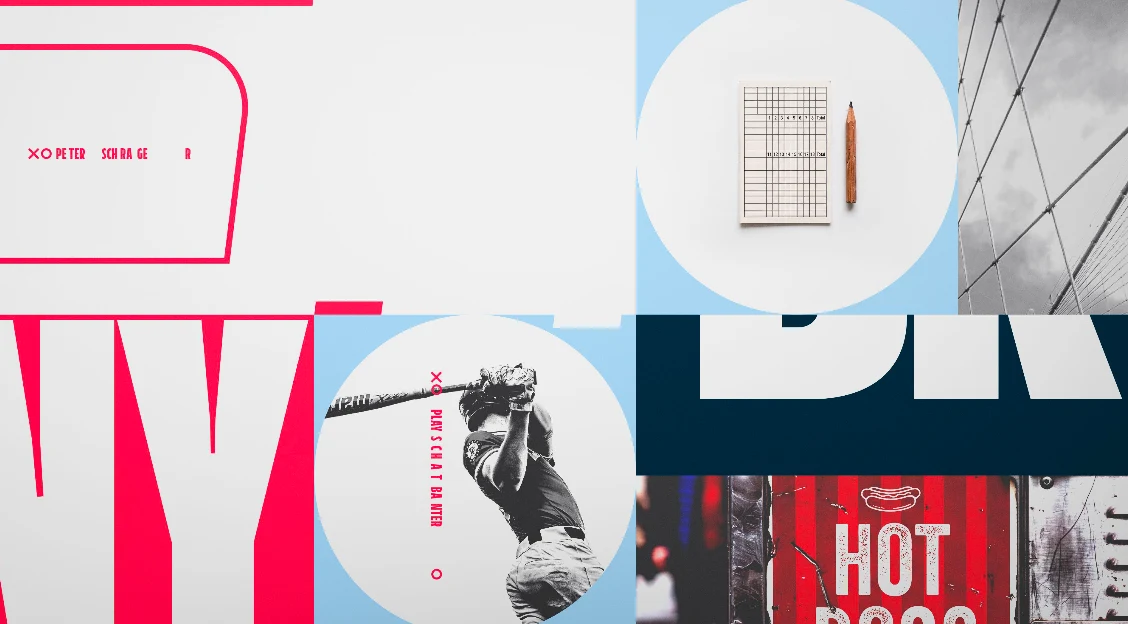
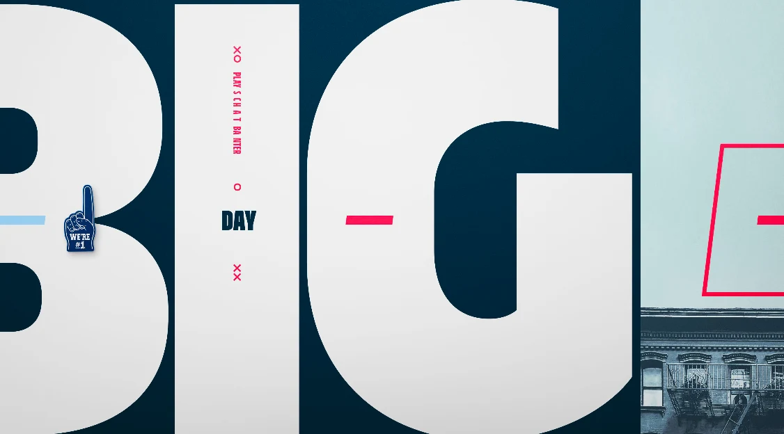
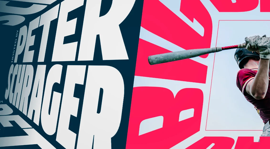
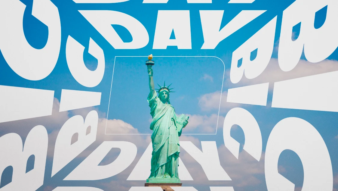
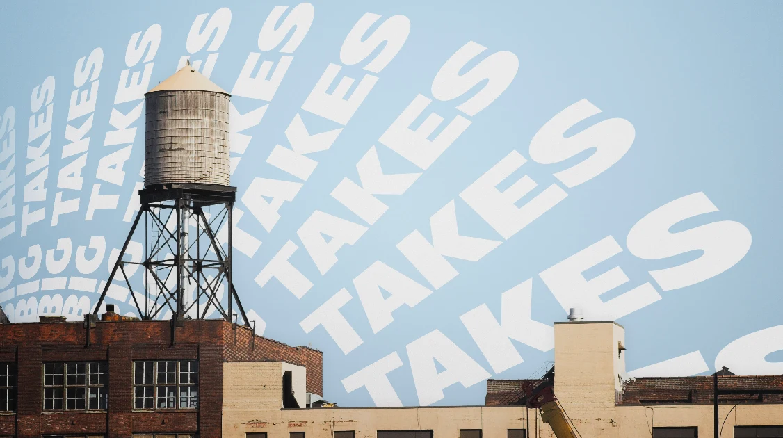
Every New York block has one: a bodega window where a Yankees pennant leans against pretzels, a scratcher ticket, and a sleeping cat - cluttered, unplanned, and somehow perfectly coherent. Big Day’s brand identity borrows that shelf: a grid of objects every sports fan has, notebooks, pennants, jerseys alongside sport shots and New York scenics, announcing the show’s territory in five seconds - New York, and every sport, side by side.
Design Exploration
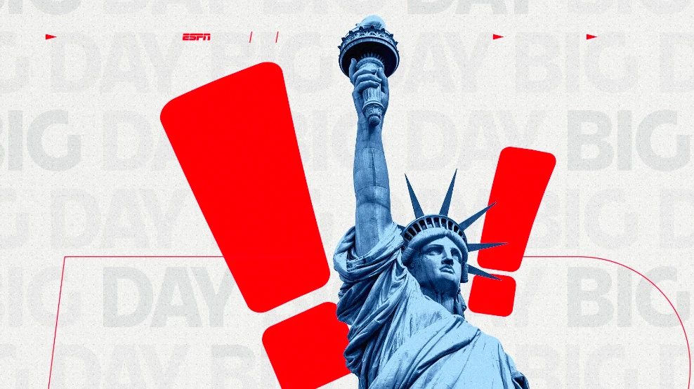
Our first round of design exploration covered five directions, each starting from a different piece of New York. One treated every segment and guest like a fight-bill headliner, stacking flat color and bold type the way the city's posters and subway car cards compete for attention. Another built the typography into the skyline, raking letters back in architectural perspective like signage on a canyon wall. A third turned the sound of a morning stoop argument into layered, deliberately unruly type, and a fourth organized the city and the game into dimensional, interchangeable compartments. The round also included logo treatments and a set of textures, among them a repeat pattern of pizza slices, pigeons, hydrants, foam fingers, and footballs.
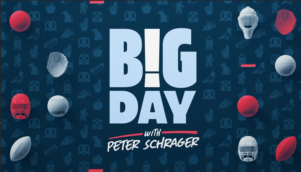
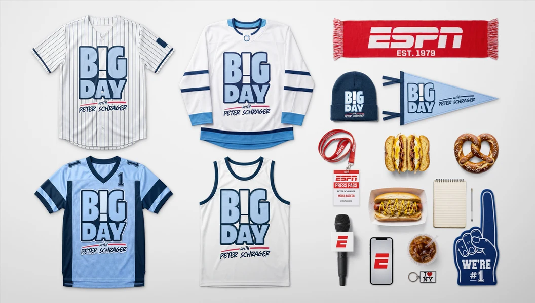

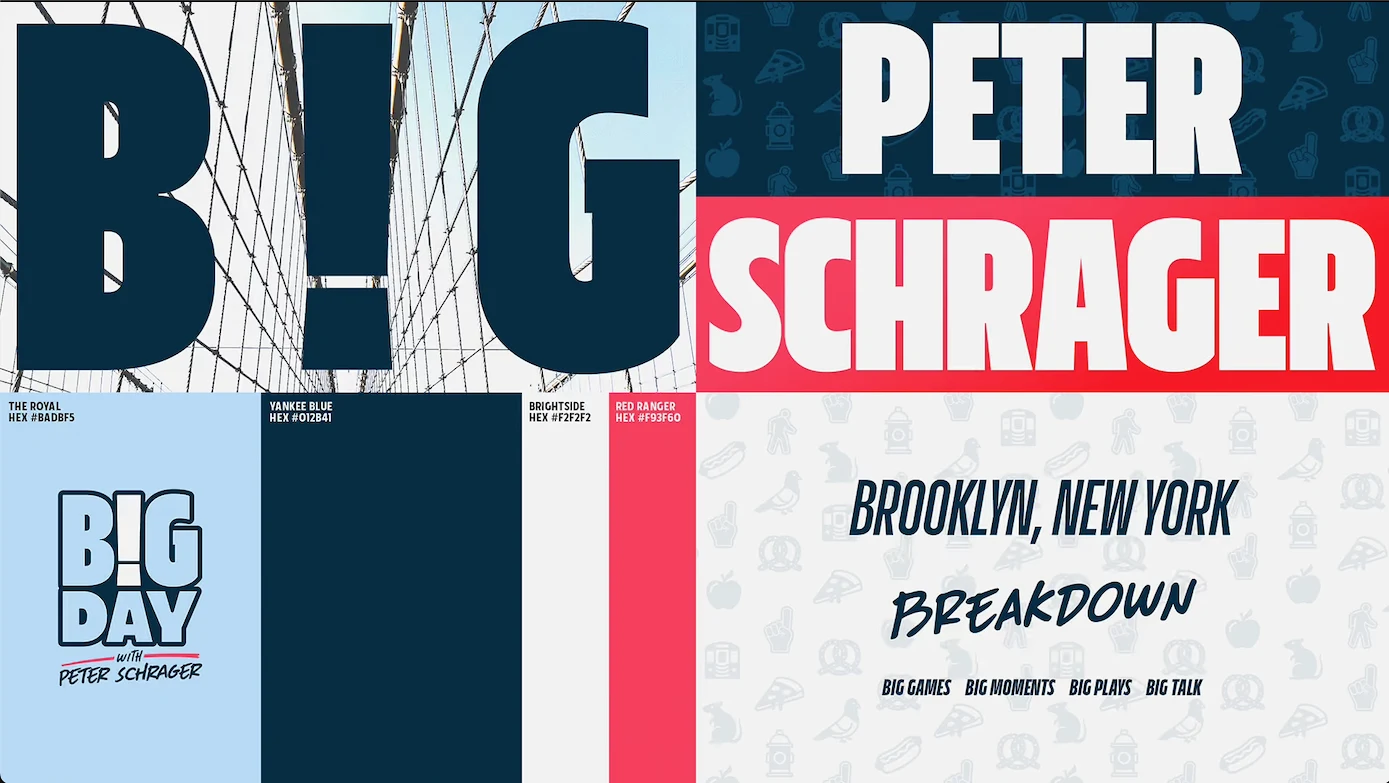
The direction ESPN selected takes its cue from the bodega window, where a team pennant, a bag of pretzels, and a scratcher ticket share a shelf and somehow make sense together. The open is built as a grid of objects every sports fan knows (jerseys, pennants, scorecards, foam fingers) alongside Brooklyn street textures, New York iconography, 3D sport icons, and ESPN branding, establishing the show's territory in five seconds: New York and every sport, side by side. The logo follows the same logic. The exclamation point in "B!G" works as a swappable slot, so the mark can hold a football, a baseball bat, a foam finger, or an ESPN mic depending on the day.
A second round developed the grid into a full system, documented in a brand style guide covering the show open, front and back ends, rejoins, logo endpages, franchise titles in four styles for recurring segments, scenic backdrops for the studio's East Array and East Window, and branded wallpaper for stand-ups and touch screens. Two rounds of exploration and a finished style guide came together in under a month, giving ESPN a system built to flex across a daily show.
Big Day airs Monday through Thursday at 2 p.m. ET on ESPN during the college football season, expanding to five days a week once the season wraps.
President, ECD
Josh Norton
EVP, Executive Producer
Carson Hood
VP, Head of Production
Virgil Conklin
Creative Director
Ross Henderson
Animation Director
Casey Drogin
Associate Art Director
Gauthier Bossuyt
Design
Nick Woythaler, Riley Carson
Animation
Momo Zhao, Yash Nasikkar, Carl Dempsey
Director of Creative Strategy & Integration, ESPN
Marissa Dempsey
Creative Producer, ESPN
Whitley Pleasant
Creative Director, ESPN
Alex Young
BGSTR helped shape the on-air design for Disney Celebrates America, the company's Fourth of July broadcast marking the nation's 250th anniversary, a 24-hour, coast-to-coast special anchored by ABC News.
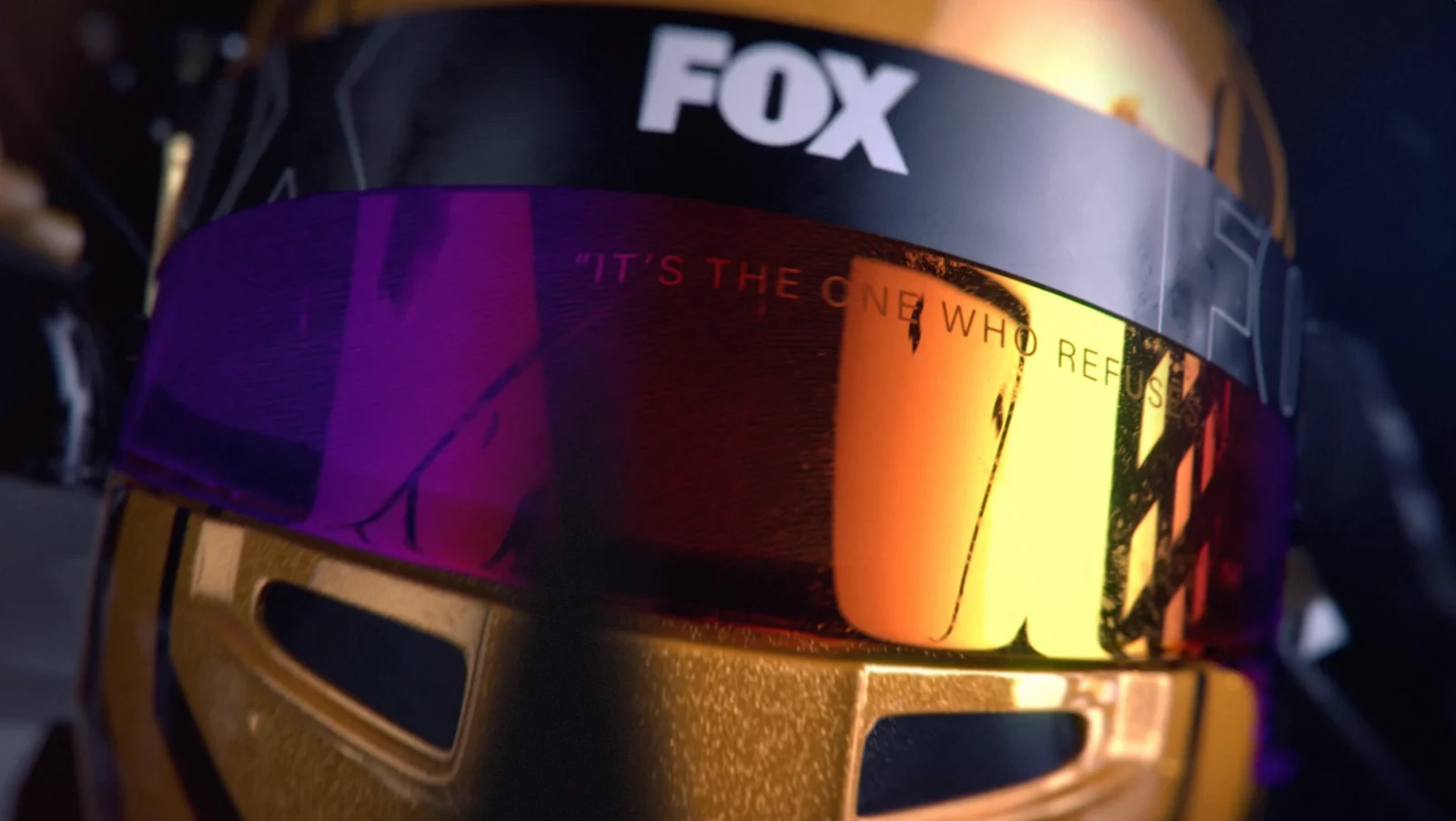
FOX Sports brought us in to design a full broadcast brand system for their upcoming season of NASCAR coverage, including a studio package, driver capture, and insert graphics. We came in with the goal to set a new bar for on-air sports design and make sure FOX’s coverage stood apart from the other sports graphics we’ve been seeing on screen.

BGSTR leapt at the chance to design a dynamic and adaptable package to showcase Turner Sports’ newest seasons of football and basketball broadcast programming.