True Detective: Night Country
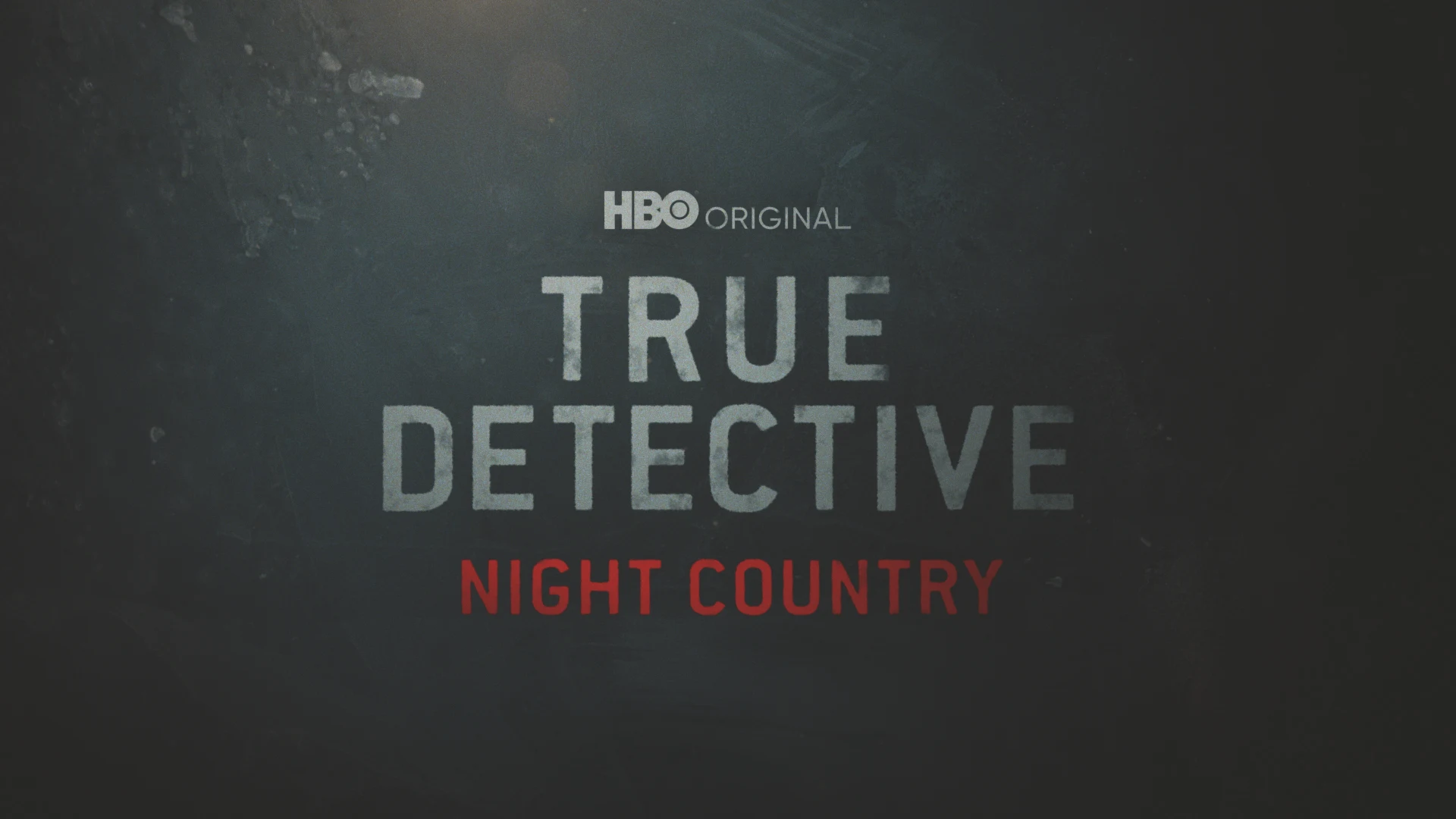
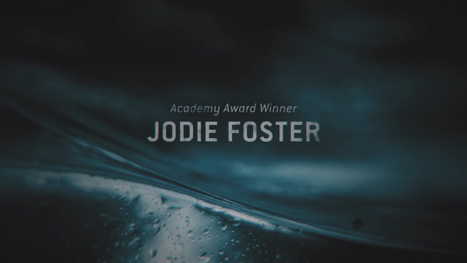
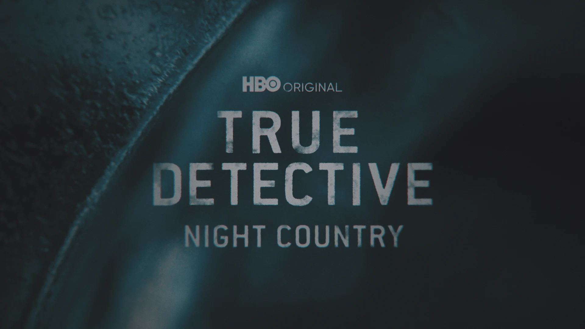
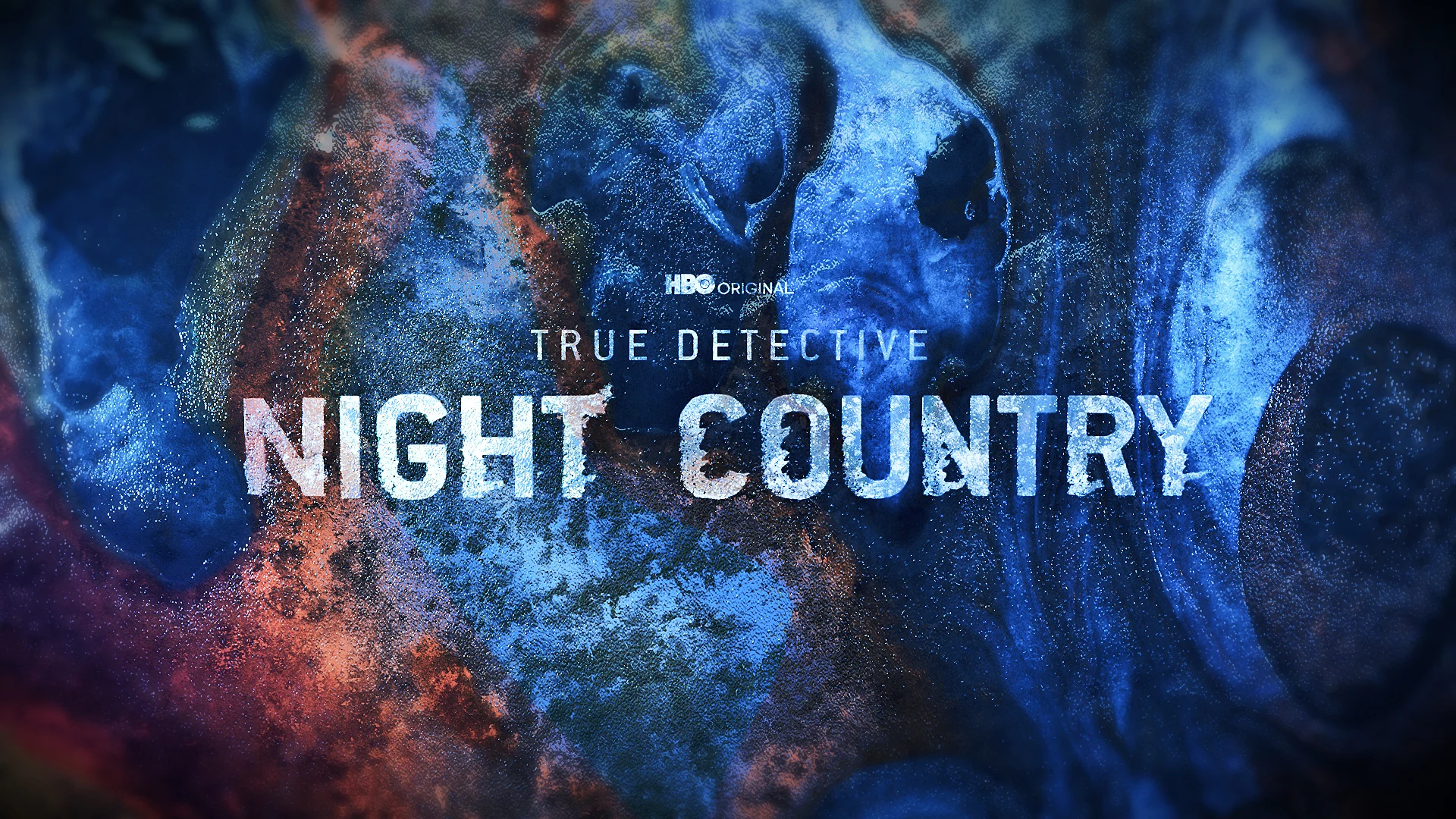
The fourth season of HBO’s critically acclaimed original series, True Detective, takes the detective procedural to a far remote location in Alaska and BGSTR designed an icy promo package for the network’s marketing efforts ahead of the season premiere.
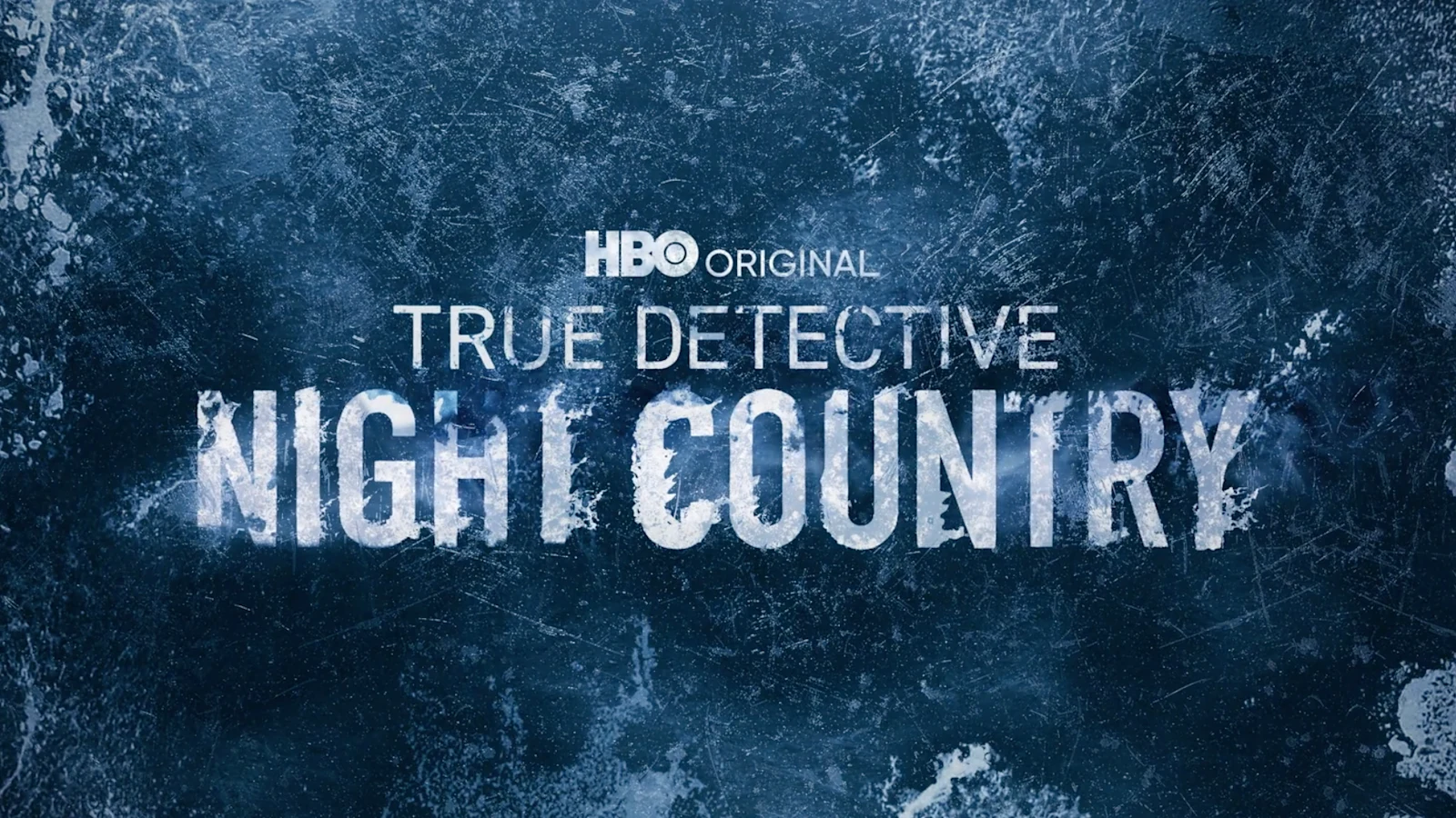
The latest installment of the series revolves around the discovery of bodies buried in ice and the mysteries that are buried, which is the inspiration behind the design we created for the promotional graphics.
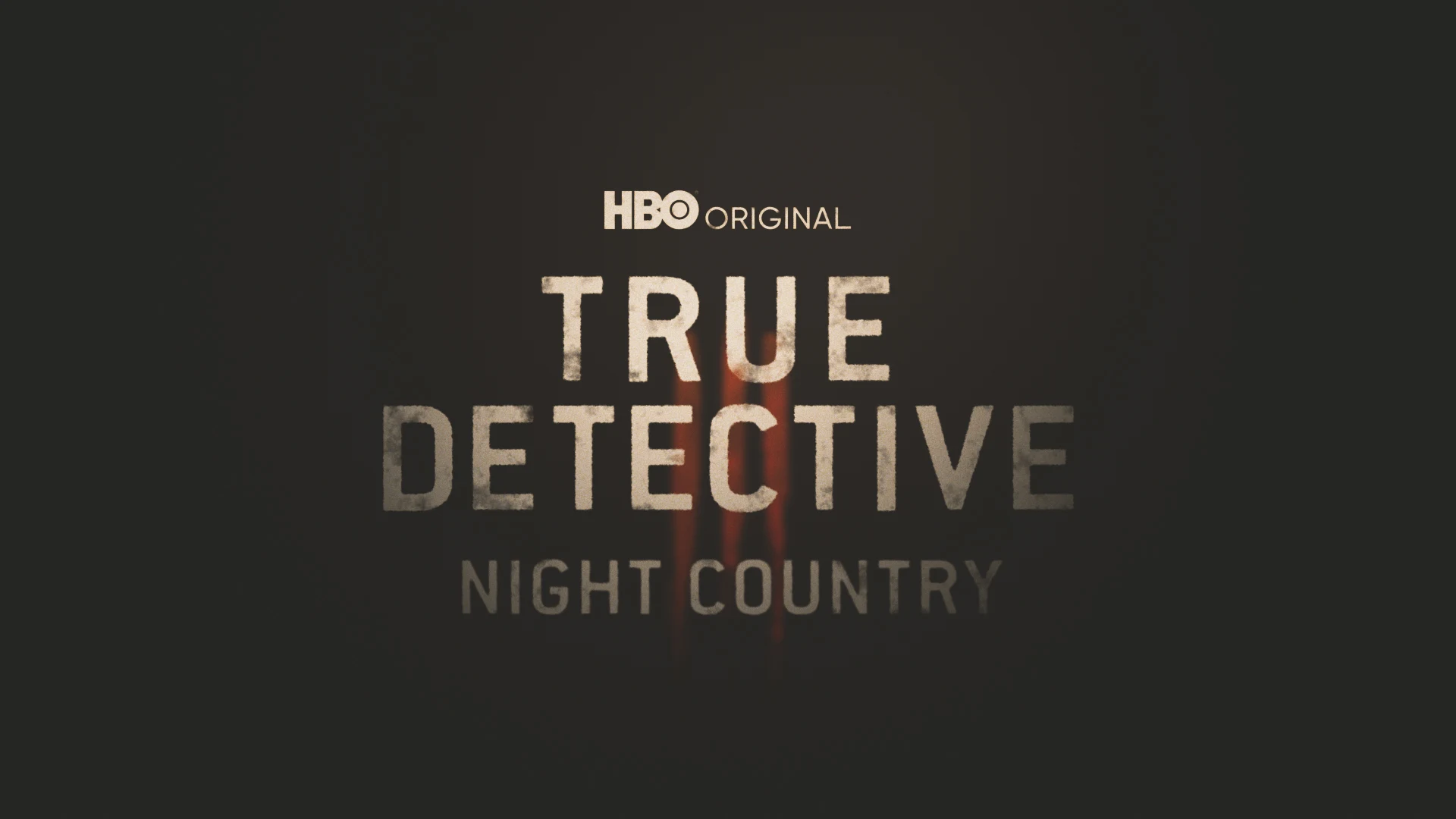
Design Exploration
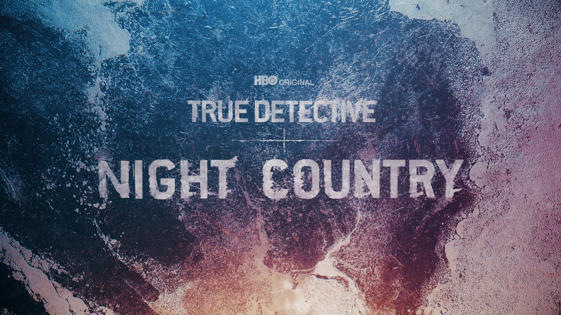
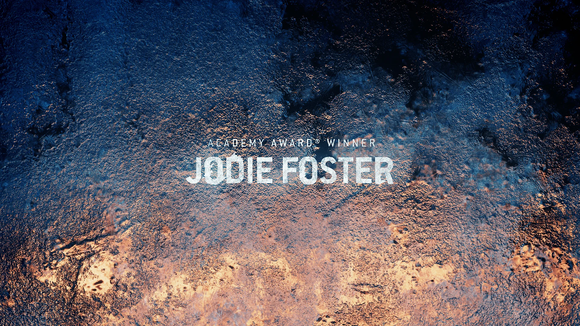
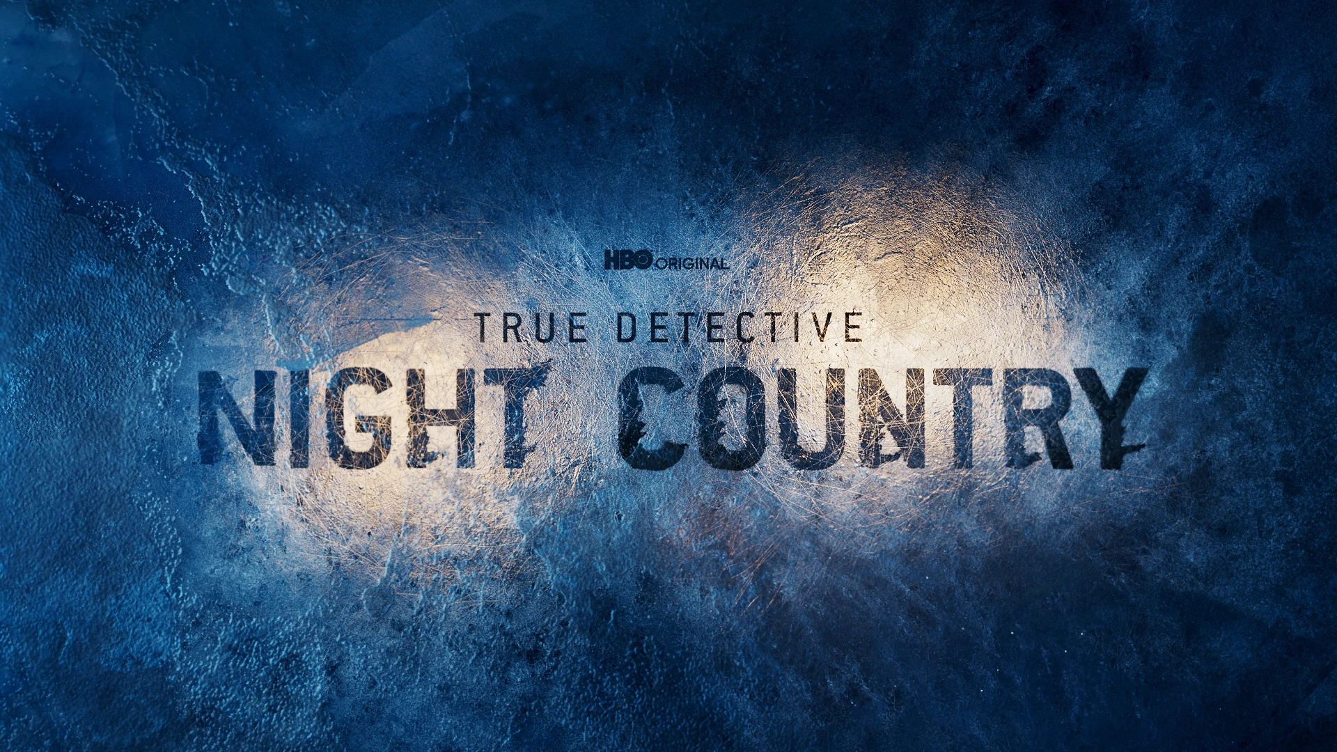
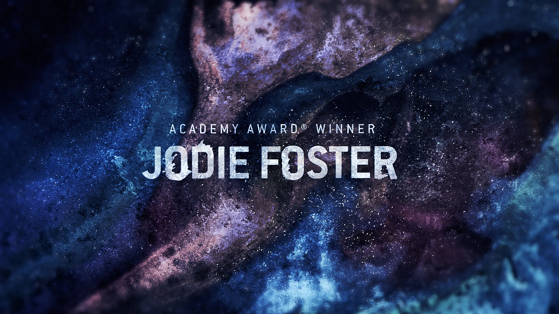
Our design rounds really explored the idea of ice and growth versus showing the bodies through the ice a little more literally. We eventually leaned into the ice growth concept and created a system not only for the background but also for the typography.
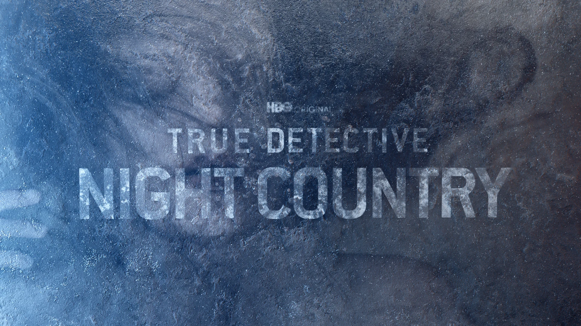
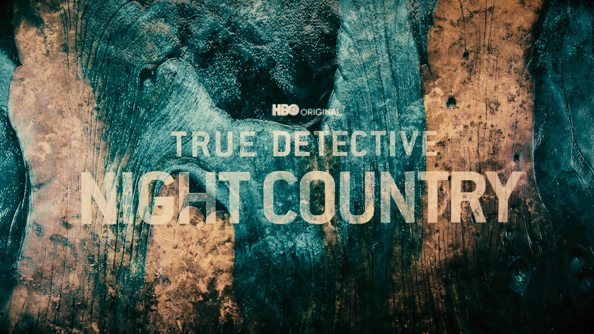
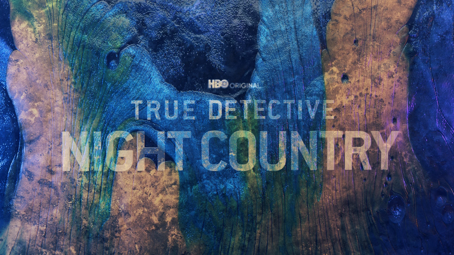
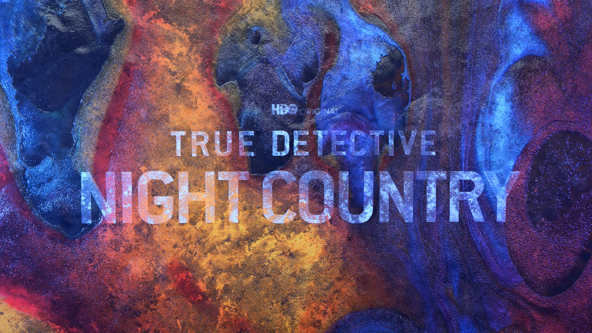
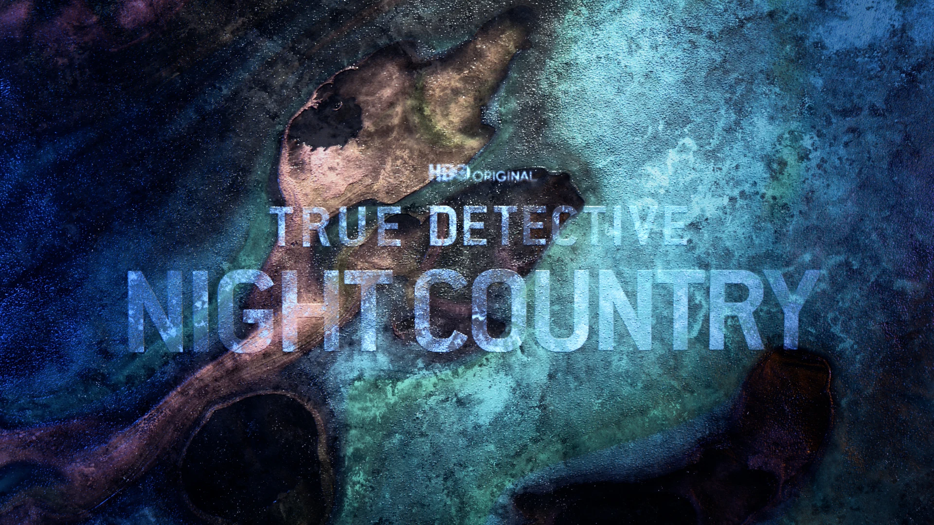
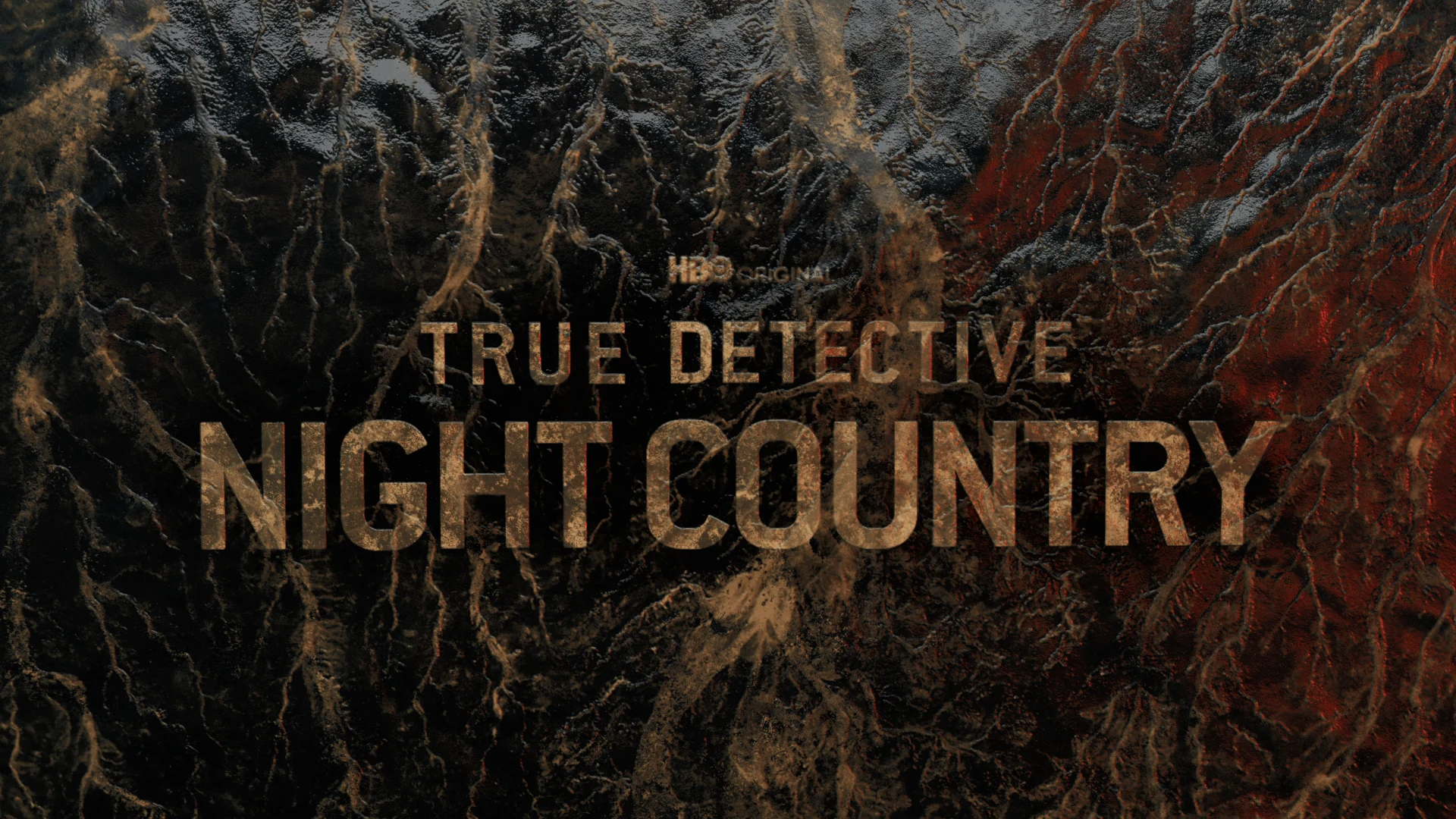
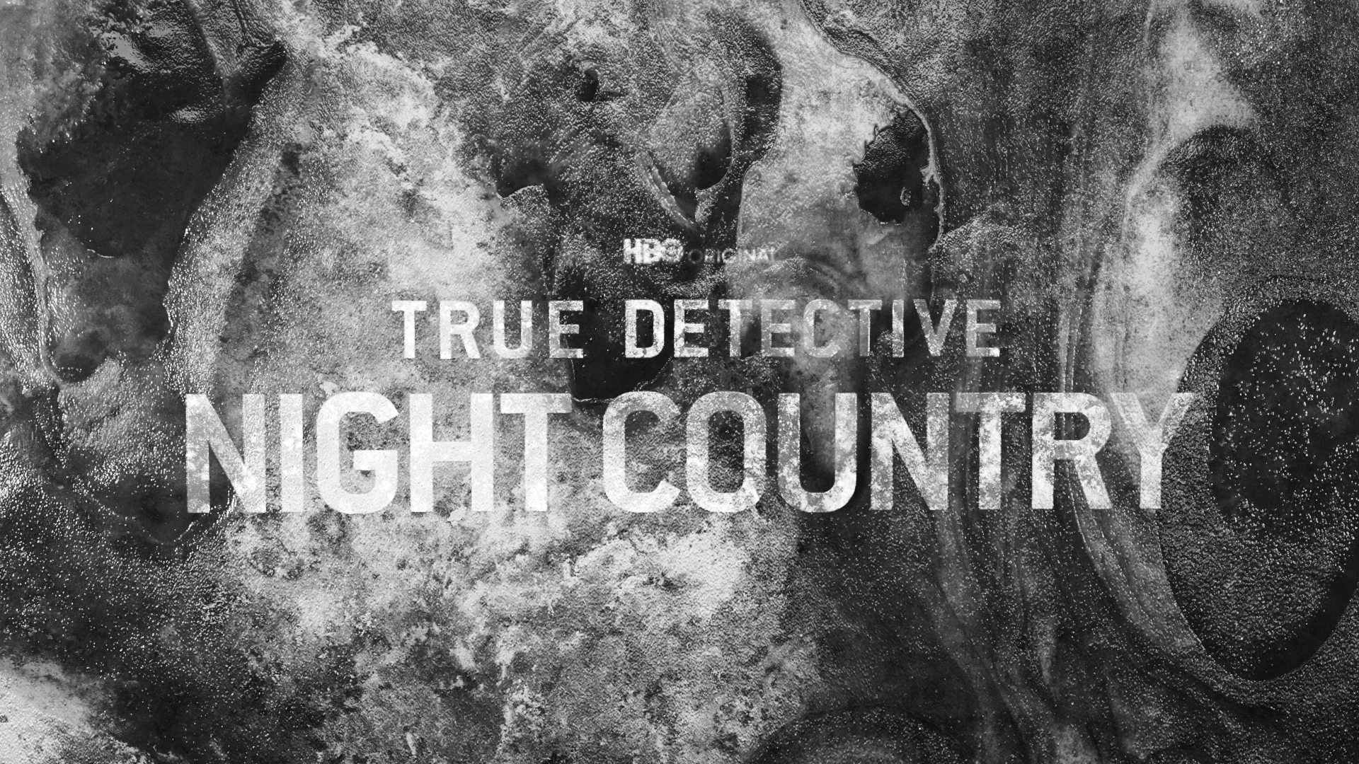
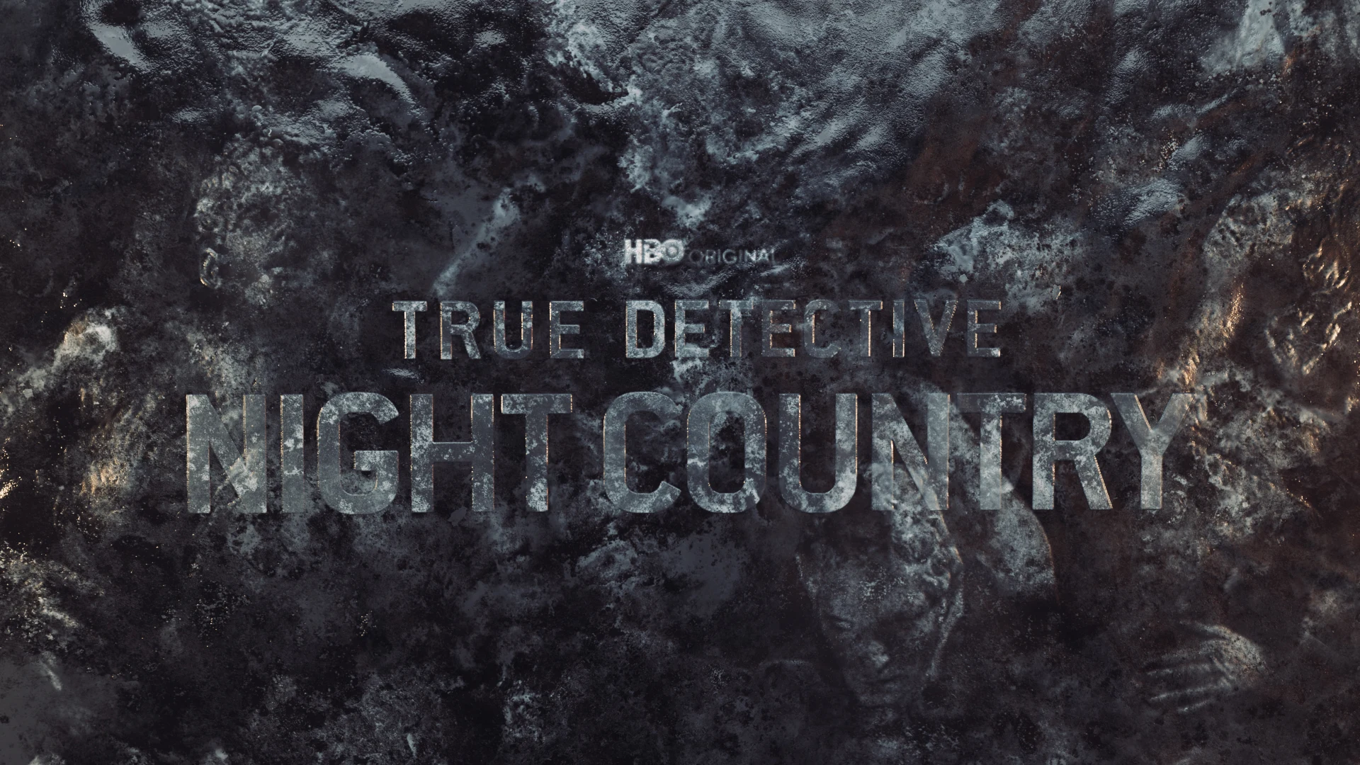
Title Design - Color Exploration
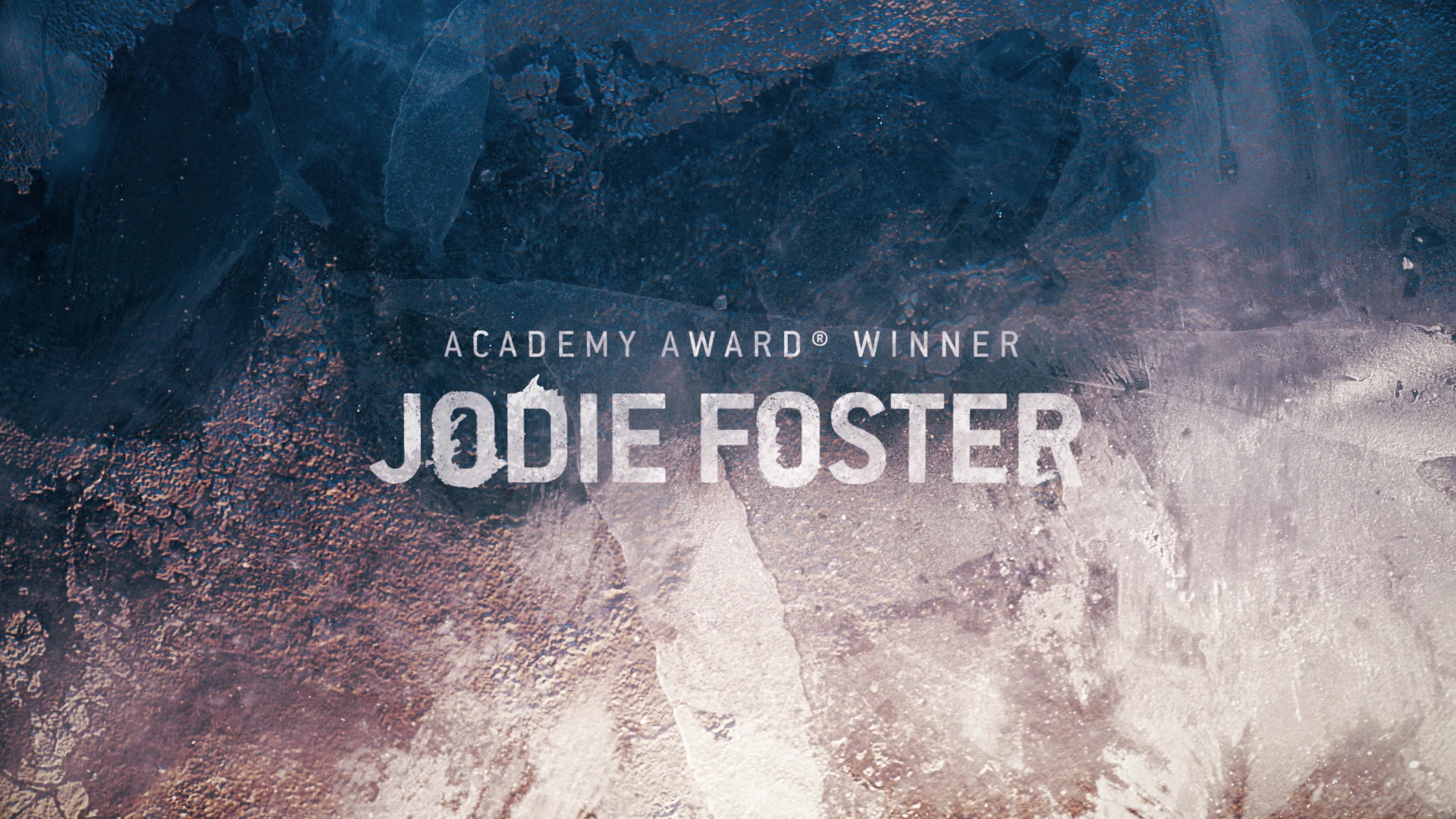
Additional Design Exploration
The growth system for the typography came from a desire to create a procedural process, empowering our client to go in and type whatever text they need and see that same growth effect. The key stroke system within the toolkit also enabled different positioning for the text to simplify any required edits.
Our goal was for the custom lettering system to feel as organic and natural as possible, so we used a lot of natural references in our growth systems. We then created ink letters and incorporated motion tests. At first the ice feels like ink and the more layers you add it starts to feel like ice—almost the same feel as a time lapse.
We developed that package with all of the network’s social needs to align with the launch of the initial promotional campaign. The package we put together included sound design we did with Eddie Cooper—an audio mnemonic to go with the visual mnemonic.
All of these visual and auditory threads were woven together to create the larger story, which was the approach we took with the animation. The client chose a filament/fiber optic style from an initial variety that included glass, fiber, liquid and a few other options, and it gave the end result a haunting glow that fit that tone perfectly.
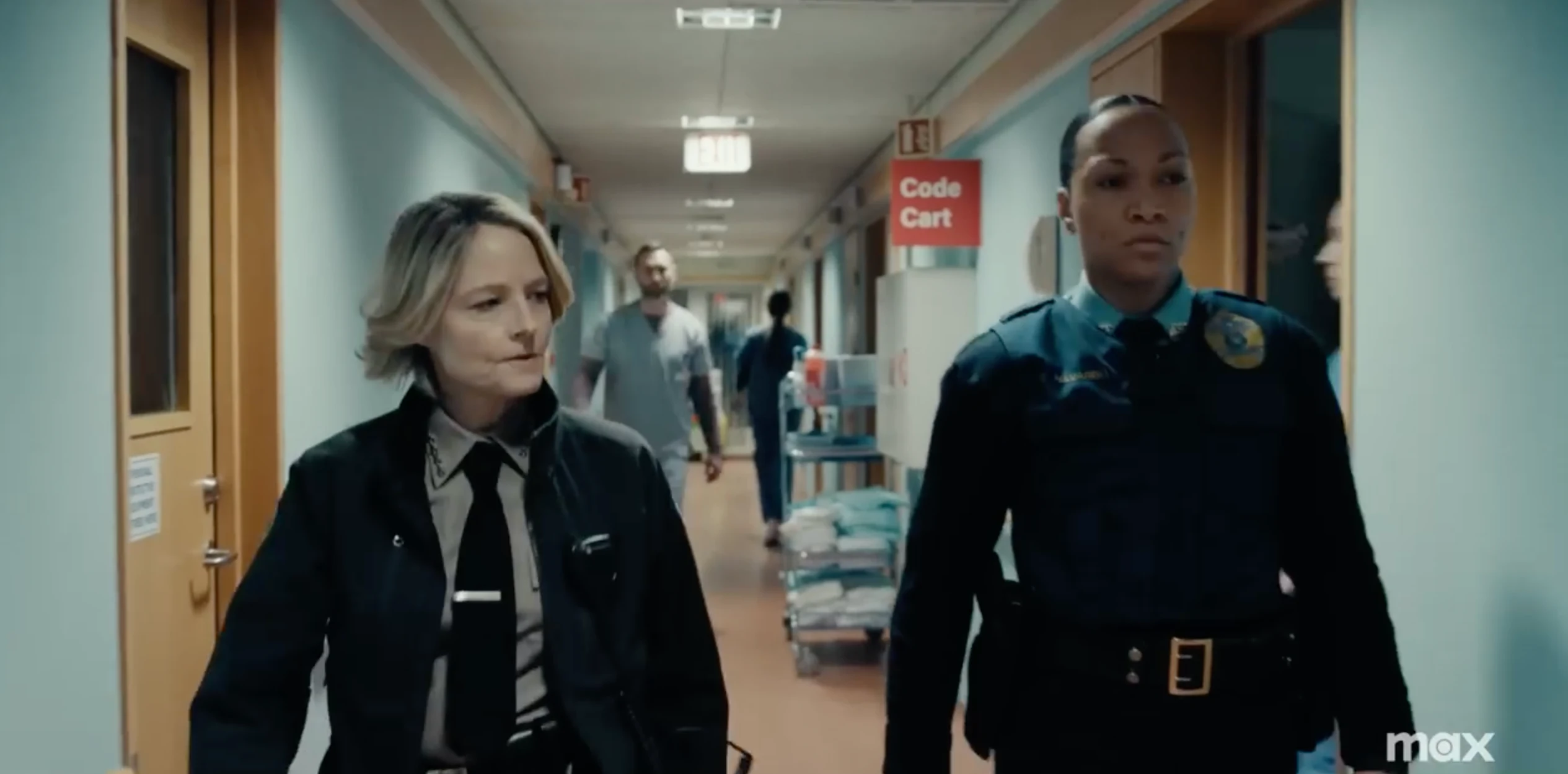
We were thrilled with how the final package came together and how we were able to pack a lot of big story into the graphics and animation for our client. True Detective: Night Country premiered in January to an audience of over 2 million viewers and a host of positive reviews.
Executive Creative Director
Josh Norton
Executive Vice President, Executive Producer
Carson Hood
VP / Head of Production
Virgil Conklin
3D Design & Animation
Nick Woythaler
Animation Director
Casey Drogin
Design
Angela Chong, Justin Nixon
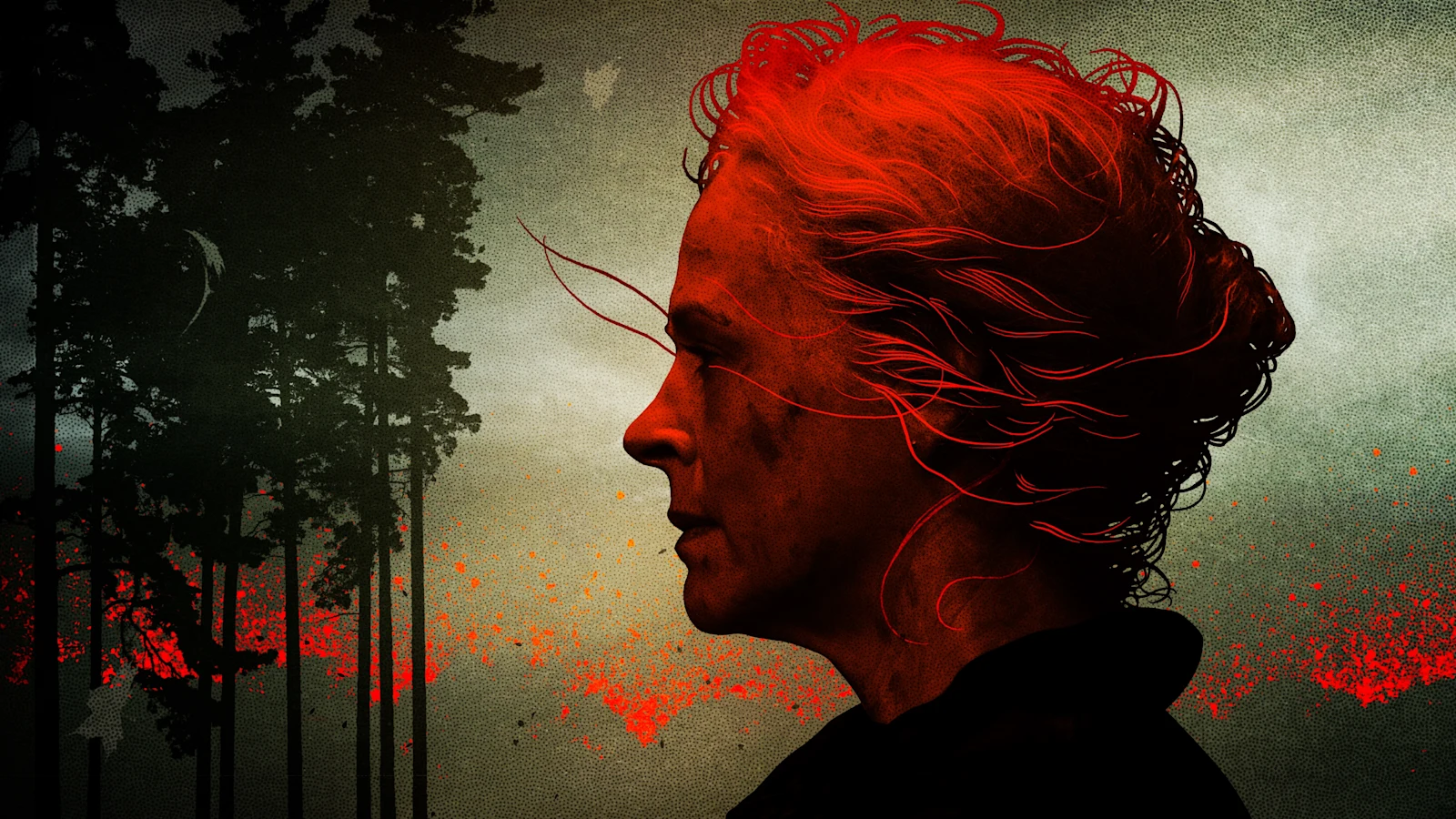
In this latest contribution to The Walking Dead universe, we collaborated with AMC to create dramatic eye-catching promos for season 10 in order to build excitement for the characters and their stories ahead of the season’s premiere.
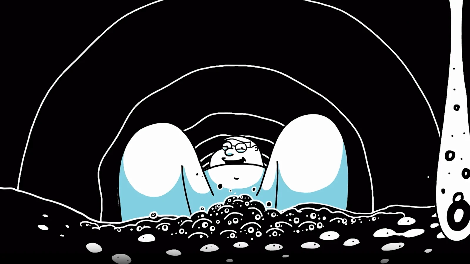
FXX has assembled a formidable lineup of animated titles produced by FX Productions or sibling 20th Television, including Archer, Cleveland, King of the Hill, The Simpsons, Family Guy, Futurama as well as Bob Burgers. With all of these epic shows under one roof, it was time to brand the programming block and cement it as the tentpole for FXX.
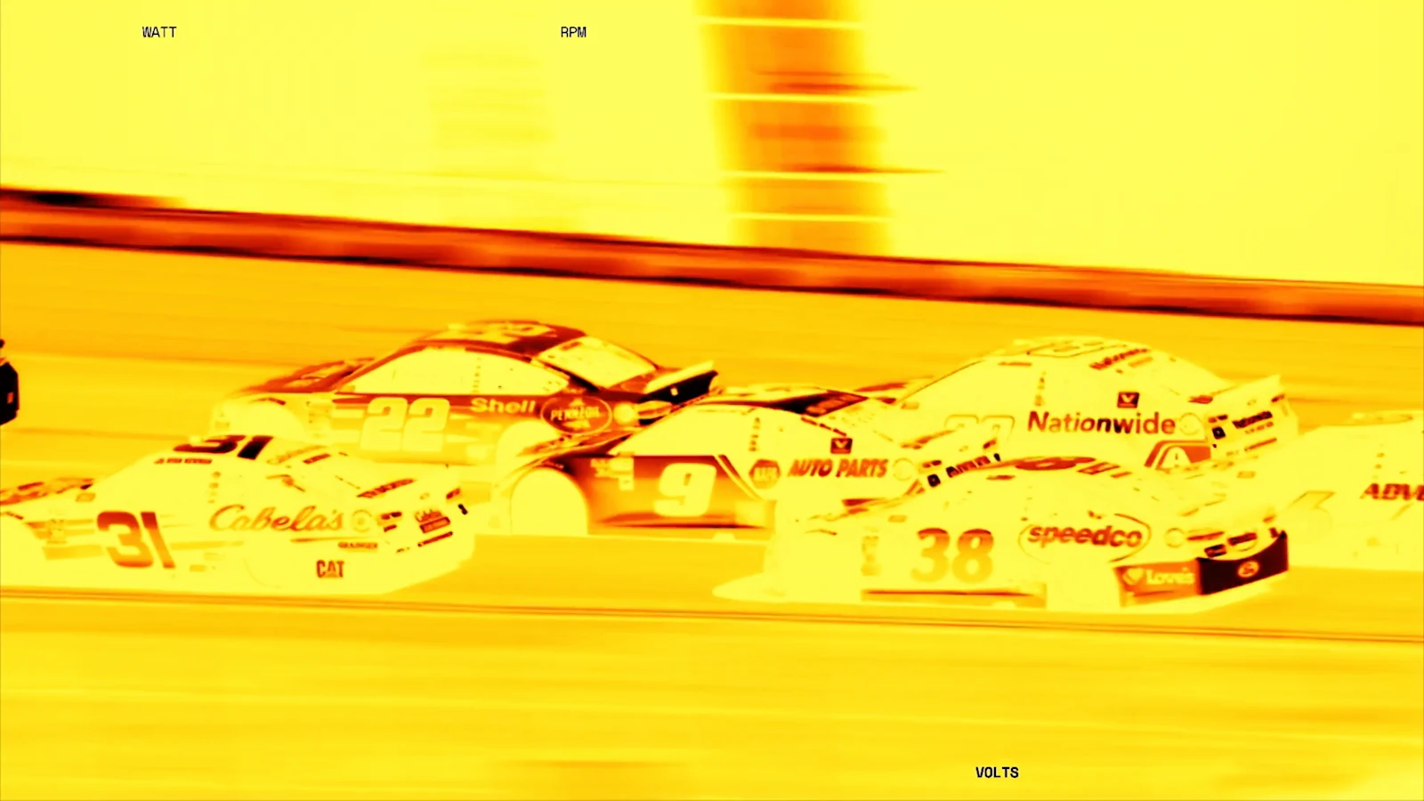
For the 2022 NASCAR season, we teamed up with our friends at Fox Sports to create a set of exhilarating and versatile promos along with a robust toolkit to rev up the engine for this Cup Series.