Cooking Channel Rebrand
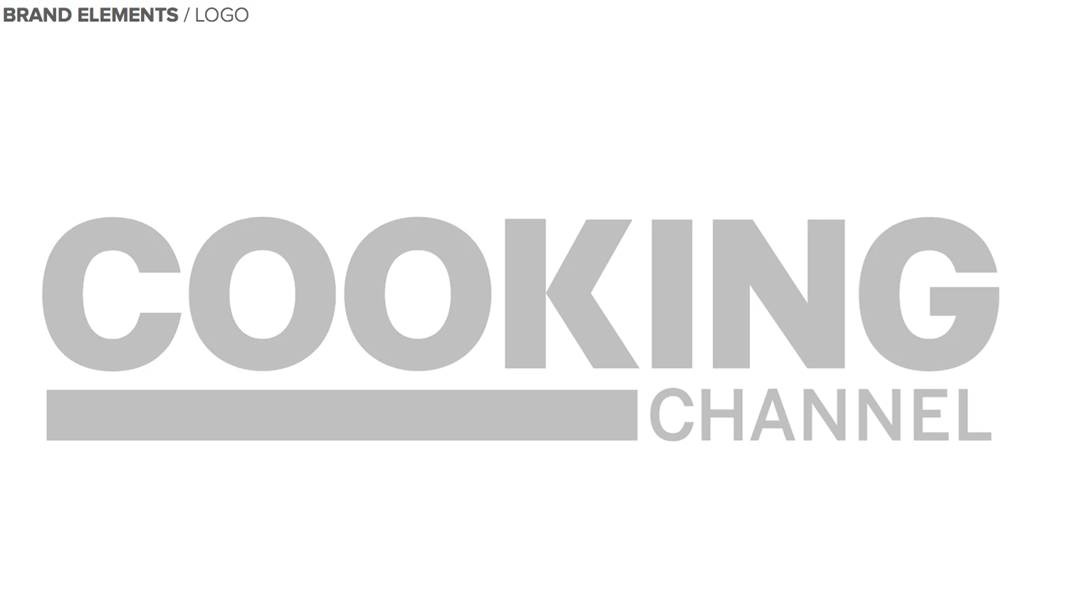
When Cooking Channel came to us looking for a brand refresh, we jumped at the opportunity to help cook something up with farm-fresh colors, shiny new cooking toolkits, and expressive flavors of language while retaining their original logo. Over the years, the Cooking Channel network has cultivated an authentic and lively personality all its own, engaging millions of viewers with great food, unique talent, and enjoyable entertainment. It was time to develop a new language to better reflect the brand’s personality, and while we were tasked to rebuild nearly everything, we had to keep the original logo in mind.
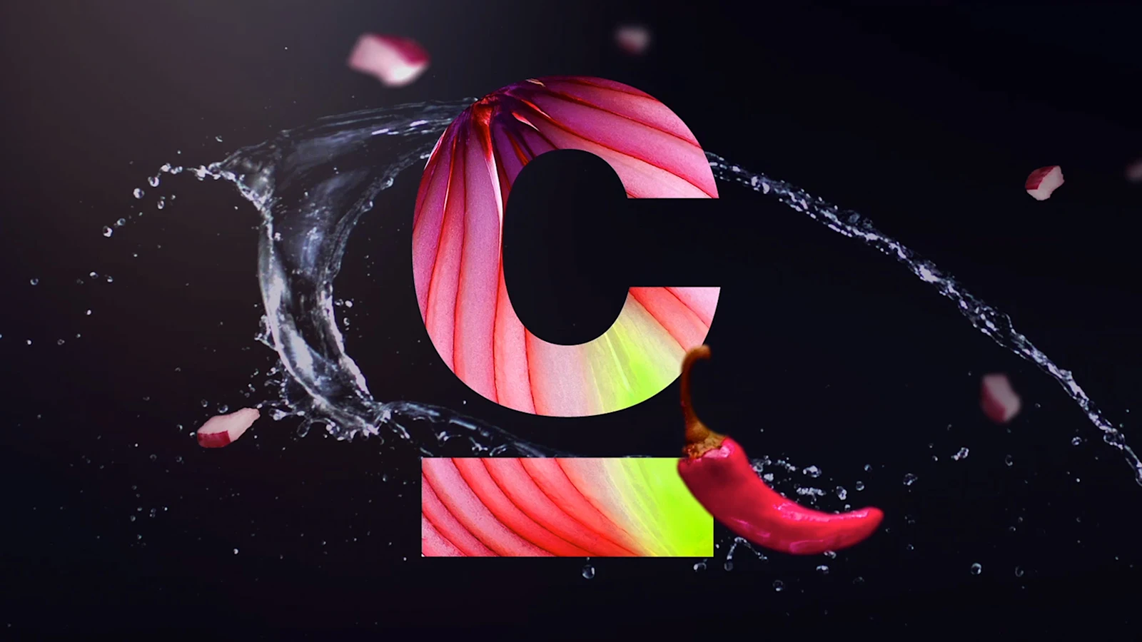
Our focus was on what makes cooking special. We wanted to visually recreate the smells, tastes, and textures of food and give our viewers a reason to connect.
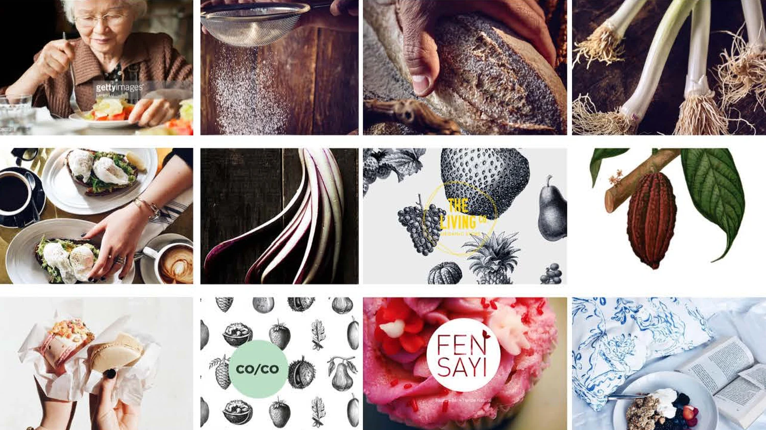

With some extensive research and a firm grasp on our message, we had our ingredients. The brand would no longer be a frame for content, but an expression of experience. We wanted to design a flexible and multi-faceted system that would be rich, vibrant, organic, expressive, and most of all, celebratory.
What better way to mesh the cooking experience and the brand elements than through beautiful footage of high-speed food falling and interacting with the logo, the talent, and everything in between?
We had found our language.

Next, we gathered together all of our materials and threw our creatives into the mix. Our best designers, producers, researchers, animators, and our trusted editor all stepped up and worked hard to create a look and feel that would sing life into the brand.
Once production took off, it saw nearly all of the seasons — winter, spring, summer, and a taste of fall. We began by establishing the new typeset, as well as building flexible color palettes and the architecture of the layouts. Ultimately, we wanted our designs and animations to behave and translate well across all platforms — broadcast, social media, and digital.
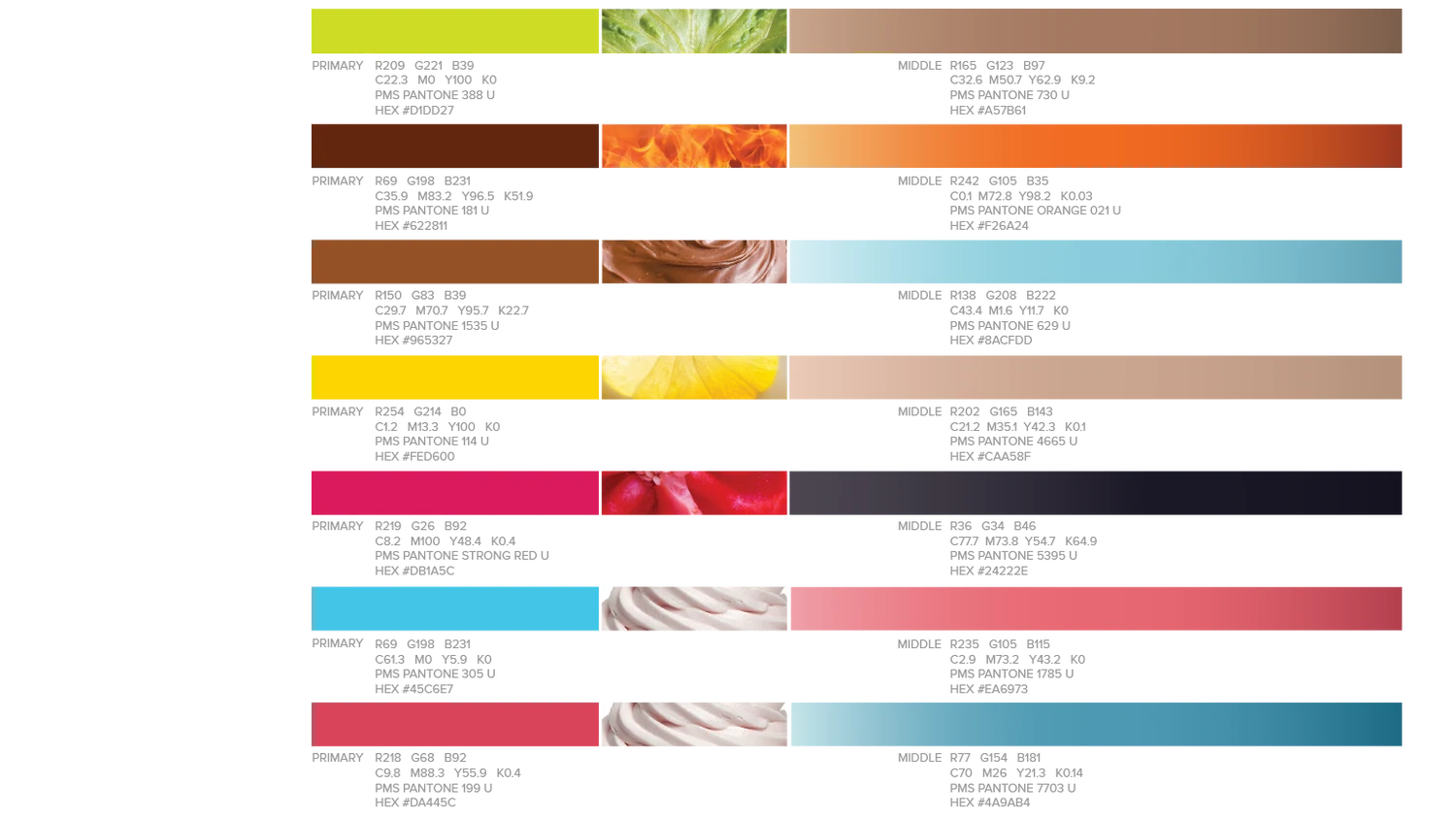
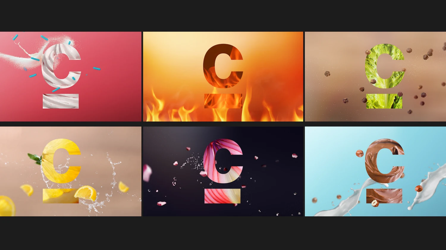
The new package launched in September, at which point Cooking Channel and our work was broadcasted internationally, across the U.S. and Canada.
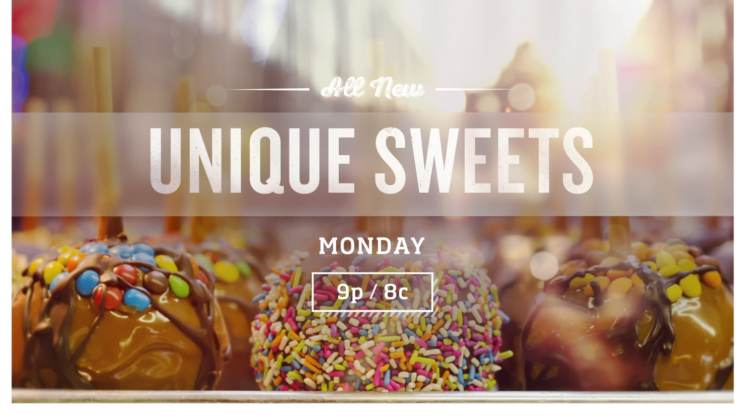
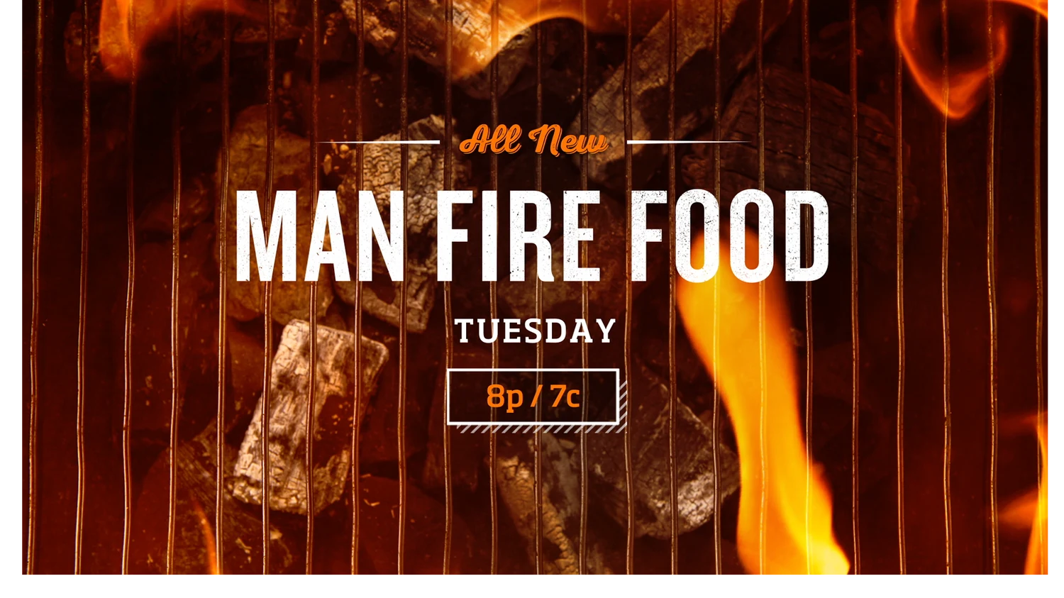
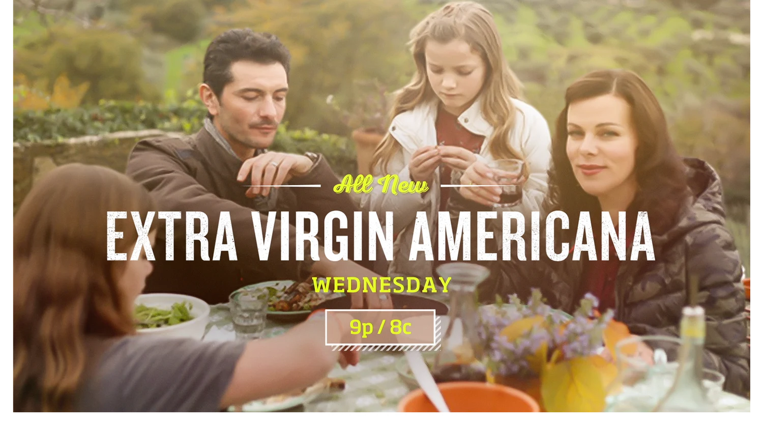
Thanks again to Cooking Channel for the opportunity to create something versatile, unique and full of personality. We would do it all again in a heartbeat.
-BGSTR

We created a fresh new system for the TNT brand, designing a flexible and bold system with graphics that would translate through for all the network's programming.
What do you get when you take an iconic legacy brand ready for an update and a desire to infuse a healthy dose of levity? A BBC America brand refresh that is eye-catching, versatile, and just the right amount cheeky, or you might say, Brit-ish.

History Channel came to us looking for an image campaign for their first ever Car Week, where collectors, buyers and traders come together to talk hot rods. The “H” animated into 5 muscle cars, putting a 3D spin on the spots that made them stand out and appeal to audiences.